I feel like you're just trying to troll this board now...
No. Just making a suggestion on the forum topic. Not sure why I'd bother wasting my time trolling this forum anyway.
Follow along with the video below to see how to install our site as a web app on your home screen.
Note: This feature may not be available in some browsers.
PLUS Your club board comp is now up!
I feel like you're just trying to troll this board now...
Do you have to be so pessimistic about it?No. Just making a suggestion on the forum topic. Not sure why I'd bother wasting my time trolling this forum anyway.
Literally 11 out of your 12 posts on bigfooty are about how tacky and shitty you find AFL jumpers, you're not fooling anyone mate.No. Just making a suggestion on the forum topic. Not sure why I'd bother wasting my time trolling this forum anyway.
Wear a team polo, t shirt or run out top, then. I do that all the time.I don't mean it as in the sleeves make the whole jumper look better. Because I also do think the designs have always been basic and bland.
Soccer jerseys and probably NRL jerseys infact are so much more classy, modern and generally wearable. Wouldn't mind showing my afl pride from time to time (No I am not a GWS supporter, glitched for some reason) but unfortunately the afl guernsey is just not street worthy.
No. Just making a suggestion on the forum topic. Not sure why I'd bother wasting my time trolling this forum anyway.

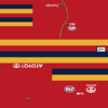
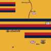
For some reason, I've never been sold on this solution and I don't really know why. I think if they were actually produced and I could see them in the flesh I might think different, but something about them on screen just looks off.Just posting Ice-Wolf 's Adelaide clash solution here as it is perfect, really, and the thread he posted it in is closed

As Not Again once posted, clash guernseys aren't about clash, they are about generating contrast.
Have this kit set, and away from home just use the kit that will generate the most contrast. Easy. No need for white, not even white shorts.
For some reason, I've never been sold on this solution and I don't really know why. I think if they were actually produced and I could see them in the flesh I might think different, but something about them on screen just looks off.
I love this setJust posting Ice-Wolf 's Adelaide clash solution here as it is perfect, really, and the thread he posted it in is closed

As Not Again once posted, clash guernseys aren't about clash, they are about generating contrast.
Have this kit set, and away from home just use the kit that will generate the most contrast. Easy. No need for white, not even white shorts.
Why is there a clash and an alternate? They look great but they're virtually the same thing.Just posting Ice-Wolf 's Adelaide clash solution here as it is perfect, really, and the thread he posted it in is closed

As Not Again once posted, clash guernseys aren't about clash, they are about generating contrast.
Have this kit set, and away from home just use the kit that will generate the most contrast. Easy. No need for white, not even white shorts.
Why is there a clash and an alternate? They look great but they're virtually the same thing.
Probably because Adelaide currently have a clash/alternateWhy is there a clash and an alternate? They look great but they're virtually the same thing.
Anyone willing to mod these into the video game so we can have a look? If anyone has the time to give us an in-game shot?For some reason, I've never been sold on this solution and I don't really know why. I think if they were actually produced and I could see them in the flesh I might think different, but something about them on screen just looks off.


Anyone willing to mod these into the video game so we can have a look? If anyone has the time to give us an in-game shot?
View attachment 416000 View attachment 416001
Yep this is the reason. It's because the red on it's own would be sub optimal they've got 3 colours may as well make use of them.Because it gives you a full set of guernseys to avoid any clash.
If you just went gold, you run the risk of still having clash issues with West Coast because of the way gold catches the eye in motion. If you just went red then you still have clash issues with Melbourne and St Kilda.
Having the set of 3 gives you the ability to contrast against anyone without using white.
Anyone willing to mod these into the video game so we can have a look? If anyone has the time to give us an in-game shot?
View attachment 416001
View attachment 416049


Given both would be worn with white shorts IRL I think the red one is excellent.
I like the thought but the execution... Freight Train , you wanna have a go at tidying this up?
Looks good, Red need to be a bit darker and with navy numbers and navy as the top hoop. Easier to imagine what it would look like on a player than just the guernsey photos
Given both would be worn with white shorts IRL
