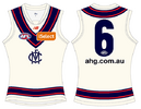
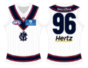
Workshop Jumper Ideas For 2024

Remove this Banner Ad

Status
Not open for further replies.
Even if you ignore the historical connection as to why we don’t want an altered version of the jumper, that just simply wouldn’t look as good. The bars look best when they’re the standalone design element, and with black and white as the colours, there’s heaps of contrast. When you add teal to the mix, that catches the eye rather than the design which should be the focal point.
Also symbolically it doesn’t make much sense to put teal above the bars - the bars are supposed to represent the pylons of the wharf in Port Adelaide, while the colour teal is supposed to represent the water in the Port River. Put that teal on top of the bars and you have a jumper that both loses the connection to the history, but also symbolises the wharf being sunk, not really the right vibe for a team that’s proud of its roots and community.
I'd keep it for showdown then It adds more to the prestige and history of the kit if it is used on occasion, like showdown and etc or in SA I would want it to feature more, I can agree with that good point about it being sunk maybe a teal graidnet below the bars ive seen that before somewhere just needs teal if its worn full time, but as said more speical if worn less the og clash kit would be my choice
 
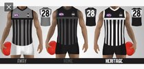
I remember drawing the first two designs years ago and putting them on here. But obviously other people were thinking the same thoughts and doing way more professional images than I could do. This would be a great AFL team set of jumpers with somewhat historical Port Adelaide look to them. IMG_2360.jpeg
 

Log in to remove this ad.

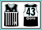
I would personally have zero issue with Port wearing this as a home jumper every week. I think this is perfect. The vee is stale and I think they need a rebrand regardless. The Prison Bar concept has changed over time and there are several slight variations. This adds to those variations and I don't think the design messes with the overall concept and heritage of the jumper. The teal makes it pop even more. I think it perfectly honors both history in the AFL and SANFL.
Port Adelaide Teal Prison Bar.png
 
I would personally have zero issue with Port wearing this as a home jumper every week. I think this is perfect. The vee is stale and I think they need a rebrand regardless. The Prison Bar concept has changed over time and there are several slight variations. This adds to those variations and I don't think the design messes with the overall concept and heritage of the jumper. The teal makes it pop even more. I think it perfectly honors both history in the AFL and SANFL.
View attachment 1919526
that works but I still think the pies and eddie would have a sook
 
I absolutely hate when people share their prison bar recolours and say "this should be a good compromise, why aren't you Port fans happy with this" as if we didn't sacrifice our entire identity and have the colour we added kind of become our entire identity. Despite this though, there is one alteration to the jumper that I wouldn't hate if it was worn. I've mocked it up really quickly and badly just as a proof of concept, and the logo positioning would need work, but you get the gist.
1709551838692.png
Given it seems we'll get to wear the unaltered jumper in home showdowns, making any alteration seems unnecessary, however I've pushed for a second home game to wear it in (be in ANZAC round or just another home game to celebrate the relevant anniversaries of any of our premierships in any given year. If this was what we had to do to make that happen, I wouldn't physically recoil at the thought. I feel like having the club's name in big ****ing bold letters on the chest would alleviate some of Collingwood's concerns about the similarities, maybe I'm wrong in assuming that, but I don't know. The reason I'm not opposed to this is because it kind of harks back to some of the Magpies jumpers of the 80s-90s with the sponsor in this exact position.
1709552151725.png
1709552184200.png
1709552194371.png
 
I hate when people make Melbourne away and clash guernseys with white in them. White isn’t one of our colours.
I don't think it's necessarily always a bad thing for Melbourne, the connection with the MCC as well as Melbourne being intertwined with the creation of our sport means a jumper like this would be somewhat meaningful. Credit to aCunningPlan of course.
1709553892627.png
It would definitely get clowned by casuals, but anyone with the slightest idea about how and why our sport came to be would at least understand the thought process behind it.
 
I don't think it's necessarily always a bad thing for Melbourne, the connection with the MCC as well as Melbourne being intertwined with the creation of our sport means a jumper like this would be somewhat meaningful. Credit to aCunningPlan of course.
View attachment 1919645
It would definitely get clowned by casuals, but anyone with the slightest idea about how and why our sport came to be would at least understand the thought process behind it.
only change I would make is putting the old monogram on there it fits better with the idea
 
I don't think it's necessarily always a bad thing for Melbourne, the connection with the MCC as well as Melbourne being intertwined with the creation of our sport means a jumper like this would be somewhat meaningful. Credit to aCunningPlan of course.
View attachment 1919645
It would definitely get clowned by casuals, but anyone with the slightest idea about how and why our sport came to be would at least understand the thought process behind it.
Wow that’s nice and a brilliant, original idea. First white one I’ve ever seen I love. Super unique too.
 
I absolutely hate when people share their prison bar recolours and say "this should be a good compromise, why aren't you Port fans happy with this" as if we didn't sacrifice our entire identity and have the colour we added kind of become our entire identity. Despite this though, there is one alteration to the jumper that I wouldn't hate if it was worn. I've mocked it up really quickly and badly just as a proof of concept, and the logo positioning would need work, but you get the gist.
View attachment 1919616
Given it seems we'll get to wear the unaltered jumper in home showdowns, making any alteration seems unnecessary, however I've pushed for a second home game to wear it in (be in ANZAC round or just another home game to celebrate the relevant anniversaries of any of our premierships in any given year. If this was what we had to do to make that happen, I wouldn't physically recoil at the thought. I feel like having the club's name in big ******* bold letters on the chest would alleviate some of Collingwood's concerns about the similarities, maybe I'm wrong in assuming that, but I don't know. The reason I'm not opposed to this is because it kind of harks back to some of the Magpies jumpers of the 80s-90s with the sponsor in this exact position.
View attachment 1919620
View attachment 1919621
View attachment 1919622
The "compromise" colours look terrible compared to the black and white. It really shouldn't be an issue, The AFL own all the copyrights.
 

(Log in to remove this ad.)

I absolutely hate when people share their prison bar recolours and say "this should be a good compromise, why aren't you Port fans happy with this" as if we didn't sacrifice our entire identity and have the colour we added kind of become our entire identity. Despite this though, there is one alteration to the jumper that I wouldn't hate if it was worn. I've mocked it up really quickly and badly just as a proof of concept, and the logo positioning would need work, but you get the gist.
View attachment 1919616
Given it seems we'll get to wear the unaltered jumper in home showdowns, making any alteration seems unnecessary, however I've pushed for a second home game to wear it in (be in ANZAC round or just another home game to celebrate the relevant anniversaries of any of our premierships in any given year. If this was what we had to do to make that happen, I wouldn't physically recoil at the thought. I feel like having the club's name in big ******* bold letters on the chest would alleviate some of Collingwood's concerns about the similarities, maybe I'm wrong in assuming that, but I don't know. The reason I'm not opposed to this is because it kind of harks back to some of the Magpies jumpers of the 80s-90s with the sponsor in this exact position.
View attachment 1919620
View attachment 1919621
View attachment 1919622
This honestly might be the best solution. Can't claim confusion with Collingwood when "PORT ADELAIDE" is smacking you in the face
 
I absolutely hate when people share their prison bar recolours and say "this should be a good compromise, why aren't you Port fans happy with this" as if we didn't sacrifice our entire identity and have the colour we added kind of become our entire identity. Despite this though, there is one alteration to the jumper that I wouldn't hate if it was worn. I've mocked it up really quickly and badly just as a proof of concept, and the logo positioning would need work, but you get the gist.
View attachment 1919616
Given it seems we'll get to wear the unaltered jumper in home showdowns, making any alteration seems unnecessary, however I've pushed for a second home game to wear it in (be in ANZAC round or just another home game to celebrate the relevant anniversaries of any of our premierships in any given year. If this was what we had to do to make that happen, I wouldn't physically recoil at the thought. I feel like having the club's name in big ******* bold letters on the chest would alleviate some of Collingwood's concerns about the similarities, maybe I'm wrong in assuming that, but I don't know. The reason I'm not opposed to this is because it kind of harks back to some of the Magpies jumpers of the 80s-90s with the sponsor in this exact position.
View attachment 1919620
View attachment 1919621
View attachment 1919622
respectfully, if you don't like other peoples ideas about your jumper, maybe don't come onto the "Jumper Ideas" page thats on the main boards... just a thought!

The whole premace of me offering a different solution to the current state is, I don't think the AFL are going to cave to COllingwood and give in on the whole "traditional" prison bars / Black&White srgument... so there are two options IMO

1 - look for an alternative, which is what I was doing
2 - Just move on, if no -one is willing to comprimise, the issue remains a stalemate, and you aint wearing the prison bars again.


Heaven forbib other people have an opinion and are happy to share on a forum designed for sharing.
 
Whilst I’m not going to move anything prior to this as it’s relatively within topic, it’s now starting to veer away from that.

Please continue any further discussion about the merits of the traditional Port Adelaide guernsey here.
 
Whilst I’m not going to move anything prior to this as it’s relatively within topic, it’s now starting to veer away from that.

Please continue any further discussion about the merits of the traditional Port Adelaide guernsey here.
Tik Tok Stare GIF

Im not doing that again
 
I don't think it's necessarily always a bad thing for Melbourne, the connection with the MCC as well as Melbourne being intertwined with the creation of our sport means a jumper like this would be somewhat meaningful. Credit to aCunningPlan of course.
View attachment 1919645
It would definitely get clowned by casuals, but anyone with the slightest idea about how and why our sport came to be would at least understand the thought process behind it.
I'm still certain this jumper would sell out within a day if executed properly. Might mock it up with 2024 sponsors and push it again.

1709630866893.png
 
Last edited:
I don't think it's necessarily always a bad thing for Melbourne, the connection with the MCC as well as Melbourne being intertwined with the creation of our sport means a jumper like this would be somewhat meaningful. Credit to aCunningPlan of course.
View attachment 1919645
It would definitely get clowned by casuals, but anyone with the slightest idea about how and why our sport came to be would at least understand the thought process behind it.
Winning the toss and batting first? Does have a bit of a cricket feel to it but overall the concept looks great! Wouldn't mind a cream base with a vee for Melbourne as an alternative kit
 
respectfully, if you don't like other peoples ideas about your jumper, maybe don't come onto the "Jumper Ideas" page thats on the main boards... just a thought!

The whole premace of me offering a different solution to the current state is, I don't think the AFL are going to cave to COllingwood and give in on the whole "traditional" prison bars / Black&White srgument... so there are two options IMO

1 - look for an alternative, which is what I was doing
2 - Just move on, if no -one is willing to comprimise, the issue remains a stalemate, and you aint wearing the prison bars again.


Heaven forbib other people have an opinion and are happy to share on a forum designed for sharing.

But they are currently wearing it in the afl?


Sent from my iPhone using Tapatalk
 
I'm still certain this jumper would sell out within a day if executed properly. Might mock it up with 2024 sponsors and push it again.

This is nearly perfect would perfer an off white looks to clean and the off white goes with the idea better
 
(For the mods who might be reading this, my justification for replying to this is that my post will still be on the topic of jumper ideas and forum etiquette and less about the prison bars. I’ve avoided all other recent debates about it so I am attempting to be cautious and not veer off topic, let me know if there is an issue with this post though 👍🏼)
respectfully, if you don't like other peoples ideas about your jumper, maybe don't come onto the "Jumper Ideas" page thats on the main boards... just a thought!

The whole premace of me offering a different solution to the current state is, I don't think the AFL are going to cave to COllingwood and give in on the whole "traditional" prison bars / Black&White srgument... so there are two options IMO

1 - look for an alternative, which is what I was doing
2 - Just move on, if no -one is willing to comprimise, the issue remains a stalemate, and you aint wearing the prison bars again.


Heaven forbib other people have an opinion and are happy to share on a forum designed for sharing.
For what it’s worth, my comments were more general and being used as a lead in to the jumper idea I had posted rather than being a crack at the jumper you posted. Despite this, even if it was a crack at you, it becomes a little ironic that you would have this response. We all post our designs on this public forum and just like anyone is allowed to post a design, anyone can share constructive feedback. I tend to post portfolios rather than individual designs so I’m not usually in the same boat, but any feedback I might receive from the fans of the team I’ve designed for is especially appreciated because they’re the fans I’m proposing the design would represent. With Port especially, you kind of have to accept that the fans are going to be just a touch more antsy about jumper designs (especially ones stemming from the prison bars) for a very obvious reason. Sometimes the response might seem harsh but we’ve had the same interactions countless times over the years, it can get tiresome. Either way, please don’t take it as a personal dig because it never is intended as such :)

Regarding the 2 options you’ve listed, I don’t expect you to have caught this given you support a different club, but there’s a 3rd option that seems as though it’s been already chosen by the club. It’s been mentioned this year that we’ve gotten permission to wear the unaltered prison bars in our home showdown every year which is what the club was seeking. This outcome eventually being allowed is the exact reason an altered design was never used by the club and why the fans never let up in pushing for it.
 
Status
Not open for further replies.

Remove this Banner Ad

Remove this Banner Ad

Back
Top