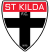
Thought I should get this started considering...
Navigation
Install the app
How to install the app on iOS
Follow along with the video below to see how to install our site as a web app on your home screen.
Note: This feature may not be available in some browsers.
More options
-
 BigFooty AFLW Notice Img
AFLW 2024 - Round 10 - Chat, game threads, injury lists, team lineups and more.
You are using an out of date browser. It may not display this or other websites correctly.
You should upgrade or use an alternative browser.
You should upgrade or use an alternative browser.
News New Saints' Logo
- Thread starter SFgiant
- Start date
- Tagged users None
Nervous for this one
Agree on this. Our current one is so timeless.Nervous for this one
Looks like the shield shape is staying. Wouldn't mind if the 150 "ribbon" design is used. I think it will be a subtle change to possibly simplify the logo at most.
Dylan8
Bar Up
Thought I should get this started considering...
It's the SFgiant one which is kept the same but dragged into the digital age or it's Bad. No in-between.
- May 23, 2016
- 771
- 922
- AFL Club
- St Kilda
- Other Teams
- Port Melbourne; Kalkee; Horsham Demons
Club getting roasted on socials, especially about the "extensive consultation" line.
If they've screwed with it too much, I might have to run for the board myself to put a halt to this garbage
If they've screwed with it too much, I might have to run for the board myself to put a halt to this garbage
- Thread starter
- #7
Mr Eagle
Bird-brain
Not a new crest, just an updated crest. Good start.
No, wait, they've said new crest in the image. Terrible start.
I'm confused. The worst start.
No, wait, they've said new crest in the image. Terrible start.
I'm confused. The worst start.
- Mar 30, 2014
- 2,736
- 4,635
- AFL Club
- Brisbane Lions

- Other Teams
- Dolphins, Seattle Kraken
Is there a reason they used KFC instead of Kilda?He's onto something ay
View attachment 2146910
Fizzler
TAKE BACK PAFC
- Dec 26, 2013
- 13,442
- 18,010
- AFL Club
- Port Adelaide
- Other Teams
- OKC, Coburg, Werribee, Storm, QPR
St.K = St KildaIs there a reason they used KFC instead of Kilda?
FC = Football Club
I assume you got that obviously, and the question is why they went with the initials over the name? If so, I reckon it was to distinguish from other St Kilda sports clubs at the time. Obviously being the only professional sporting comp that grew from a suburban Melbourne comp to the national comp, nowadays St Kilda in the AFL are the first club from the suburb that just about anyone would think of. At the time they first introduced the crest though, whenever that was, it was probably more important to denote that it was for the football club than it would be now. I’d say nowadays they wouldn’t need to do that anymore other than to uphold tradition, so perhaps there’s a chance that they do change it to say St. Kilda.
- Thread starter
- #11
Kilda Football Club. We predate the chicken people by about 70 yearsIs there a reason they used KFC instead of Kilda?
- Mar 30, 2014
- 2,736
- 4,635
- AFL Club
- Brisbane Lions

- Other Teams
- Dolphins, Seattle Kraken
Yeah obviously, but the chicken brand has taken over, wouldn't be a bad idea to go KildaKilda Football Club. We predate the chicken people by about 70 years
- Mar 30, 2014
- 2,736
- 4,635
- AFL Club
- Brisbane Lions

- Other Teams
- Dolphins, Seattle Kraken
Na purely fans of chicken i reckonSt.K = St Kilda
FC = Football Club
I assume you got that obviously, and the question is why they went with the initials over the name? If so, I reckon it was to distinguish from other St Kilda sports clubs at the time. Obviously being the only professional sporting comp that grew from a suburban Melbourne comp to the national comp, nowadays St Kilda in the AFL are the first club from the suburb that just about anyone would think of. At the time they first introduced the crest though, whenever that was, it was probably more important to denote that it was for the football club than it would be now. I’d say nowadays they wouldn’t need to do that anymore other than to uphold tradition, so perhaps there’s a chance that they do change it to say St. Kilda.
- Oct 2, 2010
- 21,021
- 76,655
- AFL Club
- St Kilda
The St Kilda crest What is it and why?

Mr Eagle
Bird-brain
I would say it should be a priority to get "St Kilda" on there. "FC" totally optional.Yeah obviously, but the chicken brand has taken over, wouldn't be a bad idea to go Kilda
Chicken, school girls and St Kilda probably not a great mix.Yeah obviously, but the chicken brand has taken over, wouldn't be a bad idea to go Kilda
- Aug 21, 2007
- 33,074
- 109,217
- AFL Club
- Port Adelaide
- Other Teams
- Aston Villa, San Antonio Spurs
It's the SFgiant one which is kept the same but dragged into the digital age or it's Bad. No in-between.
Yep. There really aren't too many untouchable type logos in the AFL IMO, but the St Kilda one just needs to be exactly what SFGiant did.
- Jun 9, 2015
- 12,587
- 9,696
- AFL Club
- St Kilda
So naturally they’ll rooster it up.Yep. There really aren't too many untouchable type logos in the AFL IMO, but the St Kilda one just needs to be exactly what SFGiant did.
St.Kilda should follow the Geelong method of two logos, a historical logo which keeps the traditions going, and a secondary logo which can be used on all promotions. Don't destroy the links to the past, use them as motivation for the future.
- Mar 30, 2014
- 2,736
- 4,635
- AFL Club
- Brisbane Lions

- Other Teams
- Dolphins, Seattle Kraken
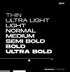
that st k.f.c. is not a pretty font is it? Closest i found isMy best guess is that it will be something like this, using the font as shown below (my best match is Brachial from matching images).
F.C. could well be in the upper section or left off, as well as the 1873.
View attachment 2148752
View attachment 2148756
View attachment 2148753
Organetto Ultra Bold Exp

- May 3, 2004
- 681
- 1,290
- AFL Club
- Geelong
I see no need to change. Timeless logo.
To justify the change, it better be good or it'll get panned.
To justify the change, it better be good or it'll get panned.
- Nov 7, 2012
- 10,658
- 34,860
- AFL Club
- St Kilda
- Other Teams
- Bristol City FC, Urawa Red Diamonds FC
These fonts had better not have anything to do with the official new logo otherwise I'll be disgusted. Moving from the timeless Futura to something akin to early 1980 low budget Sci-Fi would be up there with other classic St Kilda moves such as appointing Trout as our list manager, moving to Seaford, and extending Alan Richardson's contract. I don't see how you could modernise something so timeless without fatally dating it. Hoping to be wrong, preparing to be right.My best guess is that it will be something like this, using the font as shown below (my best match is Brachial from matching images).
F.C. could well be in the upper section or left off, as well as the 1873.
View attachment 2148752
View attachment 2148756
View attachment 2148753
Similar threads
- Replies
- 41
- Views
- 2K
- Replies
- 65
- Views
- 6K


