News New Saints' Logo

Remove this Banner Ad

I think this is like a few years ago when the AFL released the new HD recordings of the club songs and the sky was falling because the drumming wasn't exactly the same as in our original (from the 70s) recording.

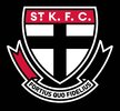
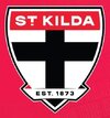
Once again, our original logo (from the 70s) has been replaced by a newer version that's been built for the modern technology that will display it. The essence of the old logo (and the even older versions that that logo is based on) are all there but there but in higher definition, and by this time next year most people will have forgotten we ever changed.

Personally, I'm indifferent to the St Kilda/StKFC debate, but I'm disappointed by our choice of font. We've been selling LOTS of merch over the last decade or so with the simplified StK wordmark (see below) and I'm disappointed that we havent kept that same rounded font type. The squarer font we've used looks a bit early 2010s rather than being the timeless font that our logo needs.

View attachment 2169331

On the ribbon, I'm disappointed that we've dropped the moto which I always felt was important to the St Kilda psyche. I understand the decision to overlay the ribbon, making it one piece instead of two, but again I'm not entirely thrilled by the "modernised" quasi-3d effect they've used.

Overall, I rate it a meh/10 and am just glad that they didn't completely bottle it.
 
I've had a lot to say about this logo retouching
Leading up to the event so it's only fair I share my thoughts on the results.

Firstly, obviously the ribbon going is upsetting a lot of Saints traditionalists. Personally, I don't mind what they've done. I think it's
I think it was inevitable that they had to lose the second piece to make the shield bigger. The motto can always be repurposed elsewhere more effectively - in fact I heard that the hem of the shirts will now have this motto inscription which is fine by me.

I like what they've done with the Est. 1873 and the red and black touches on the new scroll. It gives the vottom of the logo balance and on the scroll-less version it dies a look a bit empty. I'm not a huge fan of having a black arrow pointing down at the bottom of our logo, but it's probably a small gripe in the scheme of things and if you're into omens and symbols a big black cross isn't great anyway!

All the modernisation touches - thickening the cross, making the outline more defined and so on I think was done really well; crisp, clean and classic- no gimmicks or stuff that will date too much, no clutter.

Obviously the biggest and most contentious change is the red bar at the top. Changing "St. K.F.C." to "St. Kilda" was inevitable at some stage - I've hated every version I've previously seen of this, so I was quite fearful of how it would be done, and now that I see it, I feel... relieved. It's not "Saints" it's not "Southern", it has thrown the club's lot in with the identity of the suburb for better or worse which I'm a big fan of, as it strengthens our ties to our heritage and reduces the chances of us deciding to move interstate or make a move like the Bulldogs changing from Footscray to Western.

I loved the recent rebranding we did a few years back to just the giant "St. K" in Futura with that beautiful dot under the slightly smaller T; I thought it was iconic and brand worthy, so I'm quite disappointed to see the font changed and hope that the St. KILDA in the future might revert back to the Futura of old - but I have to admit seeing them together, the old version does already look OLD. Maybe time will tell, but the new font is a lot less dated than I had feared and I'm a big fan of it. Even the dot although its not a circle, i like what they've done to it and the T, its quite clever. If it had to change, I prefer it to all the fan-created alternatives that have different fonts.

Overall, as a Saints fan and a graphic design fan I'd give it a 7.5 out of 10.

EDIT: And I also really like the one-colour version that has been used on some club merchandise already.

Overall, it looks smart and modern without being to gimmicky or fashionable. Classic enough that it should retain style for many years.
 
Last edited:
As a Saints fan, the rebranded logo is solid, and is the best of the three rebranded logos, but is a downgrade. I would have rather had our logo rebranded to more like the 150 anniversary logo style. It is still a modernised logo and keeps the crest going. The crest, in any shape, way or form, including the cross and the red bar on top, must ALWAYS STAY!
 

Log in to remove this ad.

I think I prefer the club version, no offence.

I like the removal of the ribbon, there are too many lines down the bottom on SFGiant's version, though it is much improved from the original. I like that the crest is now the entire logo now, and that your eye is drawn to the top rather than the inscription at the bottom.

I like the new cross, that fatter style makes it look less like an actual crucifix, and more like a logo which is a-ok in my book.

I love the white space around the inside of the border and the separation between the red banner and the black outline. SFG's version looks a little heavy in comparison.

Not a huge fan of the shadow outline on the top of the new scroll - I understand why it needs to be there, but I'm concerned how it will be rendered on lower resolutions and it does look a bit 90's.

ST. K.F.C. vs ST KILDA - the three dots always annoyed me in the logo, yet removing them looked like a fast food ad. Without those meddlesome dots, the spacing is better and more balanced, on the ST. K.F.C. versions, the S and T being closer together than the KFC was problematic as was having ST. and K.F.C. appear as two separate words rather than 4 separate words (or three and a half if you're being a pedant!) Astetically it does look a lot smoother now.

The club has made various attempts to move from one to the other over the years and I think it is a good move as I detailed earlier, but I understand why it is an emotive and divisive issue. ST. KILDA both removes the ambiguity of the original for newcomers or outsiders and the exclusivity of being purely related to football, increasing the possibility of people identifying with the logo through alternate means rather than strictly footy.

* By the way, many people do not know this but Saint Kilda the Saint never existed. The club takes its name from a suburb, which takes its name from a boat, which took its name from an island in Scotland which was given the Old Norse name, and according to The Oxford Dictionary Of Saints (ironically) 5th ed. revised:

"The name is a corruption of 'Skildir', a Norse word meaning 'shields', which was given to a group of these islands west of Harris. Later it was transferred to the island Hirta, which by the late 16th century, through orthographic and cartographic error, became known as ‘St Kilda’."

So there you have it: No Saint. And the shield is central to everything, not the cross! Anyway...

As far as the font goes, my personal preference is ranked:

1. c1995 club version (Futura)
2. New club version
3. c1966 club version (Futura)
4. SFGiant version

The question is how will it age? Some recent mock ups have looked like a retro nightmare but the club version is just classic enough to stand the tests of time and still retain some style - we'll see I guess.
BigFooty.com33423502.jpg 2025CrestA.jpg
 
IMO it looks better without the ribbon.

Yeah it looks odd. Flat on top, curved at the bottom, too small in relation to the shield. Just doesn’t look right.

The position of the cross seems a bit off too. Not enough white space above the horizontal part of the cross and too much below it.

SFgiant nailed this part in their version. Absolutely perfect proportions whereby the thickness of the cross matches both the red banner and the white space in between.
 
10/10.

I get the sentiment for SFgiant’s version, especially here, but I think it’s a very strong rebrand and will age very well. Best of the three from this off season by a country mile.
 
10/10.

I get the sentiment for SFgiant’s version, especially here, but I think it’s a very strong rebrand and will age very well. Best of the three from this off season by a country mile.

Really? It doesn’t even look like a professional effort to me. Side by side with SFgiant’s version I think the new logo looks like the fan made one.

The only thing about the new one that I prefer is the change to “St Kilda” and even then the new font is a downgrade.
 
Really? It doesn’t even look like a professional effort to me. Side by side with SFgiant’s version I think the new logo looks like the fan made one.

The only thing about the new one that I prefer is the change to “St Kilda” and even then the new font is a downgrade.
The look of this one is on-par with better logo refreshes of late like the Swans. Really just feels like its cut from the same tree as theirs and the Melbourne logo which have arguably aged fine or will do so over the next 10+ years.

At the end of the day they're going for something here that can last long enough such that the "old" St Kilda crest can feel "retro", which I think will easily happen by 15 years of using this one.
 

Remove this Banner Ad

News New Saints' Logo

Remove this Banner Ad

Back
Top