- Apr 26, 2016
- 42,155
- 88,633
- AFL Club
- Sydney
- Moderator
- #126
Just don't swipe across TickyTwo in the Top 5 ain't bad at all.
Follow along with the video below to see how to install our site as a web app on your home screen.
Note: This feature may not be available in some browsers.
Due to a number of factors, support for the current BigFooty mobile app has been discontinued. Your BigFooty login will no longer work on the Tapatalk or the BigFooty App - which is based on Tapatalk.
Apologies for any inconvenience. We will try to find a replacement.
 BigFooty Tipping Notice Img
Weekly Prize - Join Any Time - Tip Round 21
The Golden Ticket - MCG and Marvel Medallion Club tickets and Corporate Box tickets at the Gabba, MCG and Marvel.
Due to a number of factors, support for the current BigFooty mobile app has been discontinued. Your BigFooty login will no longer work on the Tapatalk or the BigFooty App - which is based on Tapatalk.
Apologies for any inconvenience. We will try to find a replacement.
Just don't swipe across TickyTwo in the Top 5 ain't bad at all.
Log in to remove this Banner Ad
When Norf are do bad they are literally off the chart
You want to be towards the top right corner. Teams that win the premiership are almost always in that region, or excel greatly on either metric.Please no one judge me or call me dumb, but those graphs look like drawings my 3yo granddaughter does with her etch a sketch!
I have absolutely no understanding of what I'm seeing.
Can hardly judge you Jewels. Half the posts in this thread might as well be ancient runes to me.Please no one judge me or call me dumb, but those graphs look like drawings my 3yo granddaughter does with her etch a sketch!
I have absolutely no understanding of what I'm seeing.
Thank you for that. I kinda get it but why then are we equal 3rdish with Geelong when we have the highest percentage, the second highest points for and the second lowest points against? I would have thought we would therefore be at the top!You want to be towards the top right corner. Teams that win the premiership are almost always in that region, or excel greatly on either metric.
Similar graph to afl squiggle and the on the couch premiership region graph.
I'd say is a bit more complex than simply points for and against. Without knowing his model, it probably takes into account the quality of the opposition's defence your scoring against, and the opposition's attack your defending against.Thank you for that. I kinda get it but why then are we equal 3rdish with Geelong when we have the highest percentage, the second highest points for and the second lowest points against? I would have thought we would therefore be at the top!
You want to be towards the top right corner. Teams that win the premiership are almost always in that region, or excel greatly on either metric.
Similar graph to afl squiggle and the on the couch premiership region graph.
Can hardly judge you Jewels. Half the posts in this thread might as well be ancient runes to me.
0 | 1 | 2 | 3 | 4 | 5 | 6 | 7 | Total | |
| Bye | |||||||||
| Isaac Heeney | 9 | 10 | 9 | 4 | 9 | 6 | 7 | 54 | |
| Errol Gulden | 5 | 6 | 9 | 2 | 5 | 27 | |||
| Nick Blakey | 5 | 9 | 5 | 19 | |||||
| Brodie Grundy | 9 | 9 | 18 | ||||||
| Chad Warner | 2 | 5 | 1 | 5 | 13 | ||||
| Tom Papley | 7 | 7 | |||||||
| Oliver Florent | 2 | 5 | 7 | ||||||
| James Rowbottom | 5 | 5 | |||||||
| Justin McInerney | 1 | 1 | |||||||
| Logan McDonald | 1 | 1 |
So in my view it's a pretty nothing stat... all it shows is that teams who consistently make the finals play more top 8 sides than those who don't...That's a truly confusing stat. Tigers win 3 premierships in that time and yet are further down the list than I ever expected.


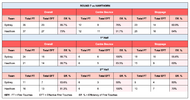
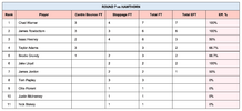
Thanks caesar88 fascinating and a correct conclusion IMO.First possession stats for this week.
Pretty even overall, but I reckon Horse & co would've wanted a bit more pressure from us in the contest, perhaps why he looked frustrated throughout the game despite the margin. Allowing a better midfield than Hawthorn's that kind of efficiency with their first use would be trouble.
View attachment 1974698
View attachment 1974699
