Opinion Adelaide Crows New Logo Discussion

The new Crows logo is...

  • Awesome

    Votes: 22 10.5%
  • Good

    Votes: 87 41.4%
  • Meh

    Votes: 55 26.2%
  • Not Good

    Votes: 17 8.1%
  • Terrible

    Votes: 29 13.8%

  • Total voters
    210

Remove this Banner Ad

Wings out as a starting point is so much better than the other crap. The design has improved, but it's still crud. Need something more intricate that looks like an actual bird.
Going pretty hard at this 1970. "Hate" and "crap" when people are just throwing out ideas.

Instead of just fire-hosing everything, put up some examples of what you do like - or even better - show us your version.
 
Going pretty hard at this 1970. "Hate" and "crap" when people are just throwing out ideas.

Instead of just fire-hosing everything, put up some examples of what you do like - or even better - show us your version.
Probably best to ignore all the backseat drivers in this thread. 🤣
 
Going pretty hard at this 1970. "Hate" and "crap" when people are just throwing out ideas.

Instead of just fire-hosing everything, put up some examples of what you do like - or even better - show us your version.
Angry Gordon Ramsay GIF by Gordon Ramsay's 24 Hours to Hell and Back

1970 in this thread
 

Log in to remove this ad.

Does a front on crow with wings out have clean edges? Why must it have clean edges, perhaps a crow isn't for us if we don't like the image of the bird itself.
Pretty much every logo in the league tries to keep the outer edges of the logo as clean as possible. I think it's because they can often be printed quite small on merch so if you have something really detailed, it won't show up well.
 
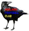
I understand the eye, but why is the beak coloured? Actually, I don't understand the coloured eye either.
It's just a nod to the 90s logo - I was trying to keep to the brief. The club has indicated that the new logo will be 'a whole crow and look more aggressive than the team's present insignia... modern with some traditional aspects, but with no shield'.

All good if it's not your thing.
 
No worries ... maybe we have different ideas on what a logo should be?

Character is a strange demand for a logo in my opinion.

All good.

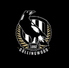
Texture is probably a better word. Cartoonish versions that a pre-schooler would knock up don’t do it for me. I like Collingwood’s Magpie. But I’m in the minority at the trained into low expectations supporter group we gave around here. Imagine preferring your logo actually look like the thing it represents.

I’ll say it again, if we’re not happy with a logo that couldn’t be mistaken for any other bird than a crow, perhaps we should choose another moniker.
 
I've never liked any of the front on crows, sorry.
It's my favourite pose for a Crow but I don't think I've ever seen it really work for a logo. None of the other bird teams are trying it on either. The closest thing is the Bombers logo.

I think a talented artist could make a front on logo that looks good.
 
Texture is probably a better word. Cartoonish versions that a pre-schooler would knock up don’t do it for me. I like Collingwood’s Magpie. But I’m in the minority at the trained into low expectations supporter group we gave around here. Imagine preferring your logo actually look like the thing it represents.

I’ll say it again, if we’re not happy with a logo that couldn’t be mistaken for any other bird than a crow, perhaps we should choose another moniker.
Maybe you have a different idea of what the logo is supposed to do here?

Do you think it's supposed to be instructive in some way?

My opinion of a good logo is one that is clear, scales well, is identifiable amongst its peers ... and looks good on merch.
 
Going pretty hard at this 1970. "Hate" and "crap" when people are just throwing out ideas.

Instead of just fire-hosing everything, put up some examples of what you do like - or even better - show us your version.

I don’t hate their versions as such, I hate the remit. What we’re stuck with is a loose outline of a crow, or numerous other birds that if not associated with us, you wouldn’t know what actual bird it is. Does Collingwood’s magpie need to be modernised?
 
I don’t hate their versions as such, I hate the remit. What we’re stuck with is a loose outline of a crow, or numerous other birds that if not associated with us, you wouldn’t know what actual bird it is. Does Collingwood’s magpie need to be modernised?
Collingwood don't have a dilemma because their team colours match the bird.

Maybe a more realistic design could work but I don't think the blue needs to be changed to black for a more realistic Crow. Blue is often used as an abstract form of black in a lot of different media. People won't question it.
 

(Log in to remove this ad.)

Maybe you have a different idea of what the logo is supposed to do here?

Do you think it's supposed to be instructive in some way?

My opinion of a good logo is one that is clear, scales well, is identifiable amongst its peers ... and looks good on merch.

Worth noting that actually looks like the animal it represents doesn’t make your list. My view is that if you took the animal drawing away from the context, first and foremost, most people should recognise what the animal is.
 
Worth noting that actually looks like the animal it represents doesn’t make your list. My view is that if you took the animal drawing away from the context, first and foremost, most people should recognise what the animal is.
Very hard to distinguish between 500 bird varieties though.
 
Collingwood don't have a dilemma because their team colours match the bird.

Maybe a more realistic design could work but I don't think the blue needs to be changed to black for a more realistic Crow. Blue is often used as an abstract form of black in a lot of different media. People won't question it.

I don't think the colour is that important, that can be represented elsewhere in the design. Or the bird being dark blue is pretty close anyway. The way I see it is we went from a decent design to Homer's 'The Homer'. And instead of shelving the idiocy and starting again from scratch, we're trying to refine what is flawed at concept. Everyone is doing their best to improve what presently exists, I'm saying scratch it completely and start again. Drawing an actual crow should be a non-negotiable.
 
It's my favourite pose for a Crow but I don't think I've ever seen it really work for a logo. None of the other bird teams are trying it on either. The closest thing is the Bombers logo.

I think a talented artist could make a front on logo that looks good.
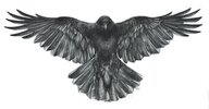
IMG_6339.jpeg

I’ve posted this from Google a couple of times. I think it could work.
 

Remove this Banner Ad

Opinion Adelaide Crows New Logo Discussion

Back
Top