errant bounce
All Australian
- May 2, 2024
- 728
- 1,113
- AFL Club
- Fremantle
- Other Teams
- South Fremantle
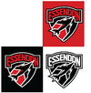
Man this is maybe the best example of a modern redo I've seen. this is really well done.I had something like this.
Looks a lot closer in spirit to the original but I think the other version would be better from a branding point of view. I think my only gripe with the current logo is the 'Essendon' wordmark looks quite dated. But otherwise if this is what the club dished up I wouldn't hate it either. I just hope they stick with the Bomber and general shape of the current logo.
View attachment 2138408


