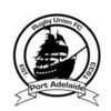
Prediction New Club Logo

Remove this Banner Ad

I have no interest in this unless it ends in us finally becoming the Port Adelaide Pirates as we should've been from the beginning.

I'd be really happy if they didn't even use the name Pirates, just kept it at Port Adelaide FC, but had some maritime/pirate type imagery in the logo.
 
This is what Jarrod Walsh would look like on the boundary while he's trying to set up a pirate and "piratte".
eac835f72ef7f018f6efec12ec417126_400x400.jpeg

This already happens in the Kids Zone.
 

Log in to remove this ad.

Pirates is stupid given we've never had any in South Australia

We quite often don't have Power either.

I haven't had a really thorough look around but i'm pretty sure they don't have any tigers in Richmond.

It's a perfect branding match. Black and white, maritime theme, raiders from another competition here to wreak havoc and plunder your treasures.
 
Forgetting how well it matches us as a club, it's objectively a branding dream. So much strong imagery to work with.
That ship has long sailed though.
 
That ship has long sailed though.

While I agree, I think it's something that could arise naturally out of the right branding.

We drop all references to Power and just become Port Adelaide, like many of us have called for for years. We phase teal down to an accent colour at most. We take advantage of our strong maritime roots with our logo and branding. A ship, the lighthouse etc.

We obviously wear the Prison Bars as a home guernsey.
 
We are a naturally maritime themed club anyway. PORT Adelaide. It's silly that we haven't taken more advantage of that outside of teal being loosely associated with the Port River. Sure, Freo went down the maritime route with the Dockers, but the sea is a big place and Pirates was right there, staring us in the face.
 
Pirates is stupid given we've never had any in South Australia
7 and a half seasons of game of thrones would state otherwise

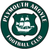
I love the pirate ship imagery that Plymouth Argyle has (their nickname is pilgrims which is not so good).
1200px-Plymouth_Argyle_FC.svg.png
 

(Log in to remove this ad.)

I was working on a Port logo rebrand sometime last year, never got to finish it hence the missing word mark. Was aiming to incorporate the current design and the PB and in doing so removing the hand and lightning bolt as I don't really like it as im sure you lot dont either. Very minimalist.
1558071923617.png
Sorry for the intrusion (found this thread on BF main page)
 
I was working on a Port logo rebrand sometime last year, never got to finish it hence the missing word mark. Was aiming to incorporate the current design and the PB and in doing so removing the hand and lightning bolt as I don't really like it as im sure you lot dont either. Very minimalist.
View attachment 675527
Sorry for the intrusion (found this thread on BF main page)
Don’t mind it at all. In fact, this could almost be a football jumper (without the ‘1870’ on the front).

A nod to the past with the PBs and the present with the teal and white ‘V’ - although the current chevron on the BiB would have to go for a more subtle version like this one.

I wonder what that would look like on a football jumper? Too busy? Or could it work?
 
I wonder what that would look like on a football jumper? Too busy? Or could it work?
I could mock one up later tonight just to see. However I was under the impression that port fans were opposed to merging the PB with the teal as it would 'taint the jumper' for lack of a better phrase.
 

Remove this Banner Ad

Prediction New Club Logo

Remove this Banner Ad

Back
Top