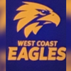
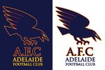
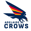
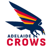
Winning a premiership straight away would do that.I can't remember what the reaction to the Eagles rebrand was on here. I know on the WCE board it wasn't well received at fist but it's grown on the majority of us.
Navigation
Install the app
How to install the app on iOS
Follow along with the video below to see how to install our site as a web app on your home screen.
Note: This feature may not be available in some browsers.
More options
-
 BigFooty AFLW Notice Img
AFLW 2024 - Round 10 - Chat, game threads, injury lists, team lineups and more.
You are using an out of date browser. It may not display this or other websites correctly.
You should upgrade or use an alternative browser.
You should upgrade or use an alternative browser.
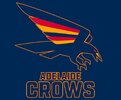
News New Crows Logo
- Thread starter _Damo_
- Start date
- Tagged users None
My recollection is that it was actually a relatively similar situation to what’s happened with the Adelaide logo.I can't remember what the reaction to the Eagles rebrand was on here. I know on the WCE board it wasn't well received at fist but it's grown on the majority of us.
A low quality image of West Coast’s jumper with the new bird on it leaked first. Just based on that people thought it looked odd, a fair few people preferred the Costa eagle - some did mock ups based off the small leaked image that were pretty accurate, then when the actual logo was revealed it was the same as whenever a team rebrands, some people liked it, some didn’t, and some just don’t like change.
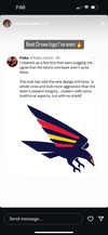
Here's another trace job by me. I honestly think this is the orientation they're going with. with the wordmark on this angle
View attachment 2124493
I’m really liking it now, and I don’t mind at all if the club runs with it.
Sent from my iPhone using Tapatalk Pro
- Oct 27, 2016
- 6,088
- 11,155
- AFL Club
- Collingwood
- Other Teams
- Packers, Raptors, Renegades
Rate that a lot. If I may make a suggestion to make this more unique compared to the original Crows logo, I’d be curious how it looks with just three thick trails, basically as thick as you have each set of three colours.
The Crow is fantastic though, good balance of old and new and done in a way where you don’t look at it and think it looks wrong without an open mouth. Well done!
Something like this? I don't mind it actually. Both logos works really well with the current wordmark, I hope they keep it but it's a bit of a long shot
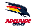
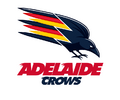
It's a starting point.Something like this? I don't mind it actually. Both logos works really well with the current wordmark, I hope they keep it but it's a bit of a long shot
View attachment 2126176
View attachment 2126181
I think it would work better if it wasn't on an angle.
And the crow into colours transition looks a little odd.
MKMatty
¯\_(ツ)_/¯
My recollection is that it was actually a relatively similar situation to what’s happened with the Adelaide logo.
A low quality image of West Coast’s jumper with the new bird on it leaked first. Just based on that people thought it looked odd, a fair few people preferred the Costa eagle - some did mock ups based off the small leaked image that were pretty accurate, then when the actual logo was revealed it was the same as whenever a team rebrands, some people liked it, some didn’t, and some just don’t like change.
We had the above image leak in late 2017. From memory a lot of people were in the 'meh' camp or disliked how unrefined the feathers were. The section around the bottom was the biggest difference between leak and actual release, so here's hoping that something similar happens for the crows and the awkwardness of the jagged feathers has since been refined.
Call again
Rookie
- Nov 4, 2014
- 38
- 21
- AFL Club
- Sydney
That thing is ABHORRENT. Where to start...the shape of the red and yellow areas..the weird notch left out of the yellow..5heres no flow to anything, it makes no visual sense..even the shape and placement of the red eye is awful.Here's another trace job by me. I honestly think this is the orientation they're going with. with the wordmark on this angle
View attachment 2124493
No Crows..dont do it.
Chezzel
Rookie
- Oct 15, 2023
- 47
- 81
- AFL Club
- Adelaide
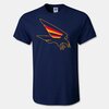
This is the one kicking around on our board that people like.
View attachment 2127597
View attachment 2127598
I rate this, by board do you mean it’s a chance? Please tell me it’s a chance, the raptor head needs to go but not if we are just gonna replace it with a robocrom.
Sent from my iPhone using BigFooty.com
I rate this, by board do you mean it’s a chance? Please tell me it’s a chance, the raptor head needs to go but not if we are just gonna replace it with a robocrom.
Sent from my iPhone using BigFooty.com
Some people will be sending these through to the club, sorry I meant BF board not AFC board.
You'd hope the Crows are smart enough to pivot and ask for submissions from the public or members, and not just blindly robocrow it.
- Jan 3, 2017
- 5,124
- 7,058
- AFL Club
- Collingwood
- Other Teams
- Celtics, Packers
The best.This is the one kicking around on our board that people like.
View attachment 2127597
View attachment 2127598
- May 5, 2019
- 4,938
- 5,370
- AFL Club
- Adelaide
100 times better.
The thing that annoys me is that they've had the clash and the Gather Round jumpers with the old crow on it and you'd think that would be setting the club up for a return to the classic logo. But no.
100 times better.
The thing that annoys me is that they've had the clash and the Gather Round jumpers with the old crow on it and you'd think that would be setting the club up for a return to the classic logo. But no
100 times better.
The thing that annoys me is that they've had the clash and the Gather Round jumpers with the old crow on it and you'd think that would be setting the club up for a return to the classic logo. But no.

- May 5, 2019
- 4,938
- 5,370
- AFL Club
- Adelaide
fancyscum
Radical Crommunist
Not a fan of using the 'gather round' style outline on a logo. Works on the jumper because it is really large and easy to see, but on all of these tiny jpegs the colours merge and just look like an orange line.
FR0GGY
From a cartel villa in Tuscany
I'll be honest that is the best Adelaide Crows logo I've ever seen, love everything about it. Excellent nod to the original logo while making it look more anatomically like an actual crow. Please be real!
My only question is if there is a way to make the eye a little more menacing. I had a quick go at it.
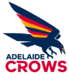
I have no doubt the final version is going to stink compared to this.I'll be honest that is the best Adelaide Crows logo I've ever seen, love everything about it. Excellent nod to the original logo while making it look more anatomically like an actual crow. Please be real!
My only question is if there is a way to make the eye a little more menacing. I had a quick go at it.
View attachment 2131423
gocrows_jack
Draftee
- Oct 16, 2022
- 9
- 10
- AFL Club
- Adelaide
SA_Great
Debutant
- Oct 2, 2024
- 54
- 245
- AFL Club
- Adelaide
Hey gang - I noticed that a couple of designs that I put together and shared on Twitter had made their way here - even a couple of adaptations floating around on BF which look really cool.
Here are the latest versions - I tried to base the design on the what the club has stated about the new logo whilst keeping the 90s reference...
Keen to get your thoughts - the first option probably looks better to my eye, but the 2nd follows the guernsey order with wing colours.
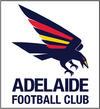
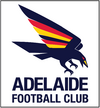
Here are the latest versions - I tried to base the design on the what the club has stated about the new logo whilst keeping the 90s reference...
Keen to get your thoughts - the first option probably looks better to my eye, but the 2nd follows the guernsey order with wing colours.


- Oct 10, 2018
- 1,776
- 3,839
- AFL Club
- North Melbourne
- Other Teams
- ^ I don't actually go for North.
Have you sent these to the club?Hey gang - I noticed that a couple of designs that I put together and shared on Twitter had made their way here - even a couple of adaptations floating around on BF which look really cool.
Here are the latest versions - I tried to base the design on the what the club has stated about the new logo whilst keeping the 90s reference...
Keen to get your thoughts - the first option probably looks better to my eye, but the 2nd follows the guernsey order with wing colours.
View attachment 2132327 View attachment 2132328
SA_Great
Debutant
- Oct 2, 2024
- 54
- 245
- AFL Club
- Adelaide
Just in a cold email to the membership line, but I haven't heard anything back - I don't really have any connections!Have you sent these to the club?
Hey gang - I noticed that a couple of designs that I put together and shared on Twitter had made their way here - even a couple of adaptations floating around on BF which look really cool.
Here are the latest versions - I tried to base the design on the what the club has stated about the new logo whilst keeping the 90s reference...
Keen to get your thoughts - the first option probably looks better to my eye, but the 2nd follows the guernsey order with wing colours.
View attachment 2132327 View attachment 2132328
Good crow, awful text
Mr Eagle
Bird-brain
I personally think that matching up with the jumper hoops is very preferable.Hey gang - I noticed that a couple of designs that I put together and shared on Twitter had made their way here - even a couple of adaptations floating around on BF which look really cool.
Here are the latest versions - I tried to base the design on the what the club has stated about the new logo whilst keeping the 90s reference...
Keen to get your thoughts - the first option probably looks better to my eye, but the 2nd follows the guernsey order with wing colours.
View attachment 2132327 View attachment 2132328
Similar threads
- Replies
- 41
- Views
- 2K
- Replies
- 65
- Views
- 6K


