Love it as usual mate!I think they just increased the quality of the crest. There's definitely some more 'crispness' to it now.
I've updated my concept a bit more. Have a geez. The bottom crest is the update.
View attachment 825545
I fell in love with a font and decided to use it for the saints (that C tho). It also allows for a bit of cool movement when italicised..
View attachment 825546
View attachment 825547
Let me know what you think!!
Navigation
Install the app
How to install the app on iOS
Follow along with the video below to see how to install our site as a web app on your home screen.
Note: This feature may not be available in some browsers.
More options
-


LIVE: Sydney v Port Adelaide - 7:40 / 7:10 Fri
Squiggle tips Swans at 57% chance -- What's your tip? -- Teams on Thurs »
-


LIVE: Geelong v Brisbane Lions - 7:30PM Sat
Squiggle tips Cats at 54% chance -- What's your tip? -- Teams on Thurs »
-
 BigFooty Tipping Notice Img
Weekly Prize - Join Any Time - Tip Prelim Finals
The Golden Ticket - MCG and Marvel Medallion Club tickets and Corporate Box tickets at the Gabba, MCG and Marvel.
Round SF Winner: And_ROOS
-
 BigFooty AFLW Notice Img
AFLW 2024 - Round 4 - Chat, game threads, injury lists, team lineups and more.
You are using an out of date browser. It may not display this or other websites correctly.
You should upgrade or use an alternative browser.
You should upgrade or use an alternative browser.
Opinion The Shield and Ribbon: Updating the Sacred
- Nov 7, 2012
- 10,367
- 33,873
- AFL Club
- St Kilda
- Other Teams
- Bristol City FC, Urawa Red Diamonds FC
I like this update a lot and agree about the font and the CI think they just increased the quality of the crest. There's definitely some more 'crispness' to it now.
I've updated my concept a bit more. Have a geez. The bottom crest is the update.
View attachment 825545
I fell in love with a font and decided to use it for the saints (that C tho). It also allows for a bit of cool movement when italicised..
View attachment 825547
Let me know what you think!!
...but I still prefer Futura! I'm not usually a traditionalist, but that font on the crest banner is just so perfect, the only thing I'd change from the original is
- the red, which I'd change to your darker version,
- the outline, which I'd go halfway between yours and the original,
- and the letter spacing which I'd decrease a little from the original
EDIT: I just quickly tried to "redo" your latest effort with futura and now realise what you're talking about. Futura rocks, but in italics is pretty meh, your version is definitely a better italicised version.
I include that and my rip off of your good work with futura in non-italics, as well as a cheeky black on white version for anybody who gives a monkey's. (sorry about the shabbiness of the text outlines, like I said, just a quickie!)
Cheers SFgiant, I love your work, hope you don't mind me borrowing most of it, I certainly don't want to pass it off as my own, just kind of messing around with it. I don't really have time to do it properly or to show you what I mean with the crest banner.
I like this update a lot and agree about the font and the C
...but I still prefer Futura! I'm not usually a traditionalist, but that font on the crest banner is just so perfect, the only thing I'd change from the original is
- the red, which I'd change to your darker version,
- the outline, which I'd go halfway between yours and the original,
- and the letter spacing which I'd decrease a little from the original
EDIT: I just quickly tried to "redo" your latest effort with futura and now realise what you're talking about. Futura rocks, but in italics is pretty meh, your version is definitely a better italicised version.
I include that and my rip off of your good work with futura in non-italics, as well as a cheeky black on white version for anybody who gives a monkey's. (sorry about the shabbiness of the text outlines, like I said, just a quickie!)
Cheers SFgiant, I love your work, hope you don't mind me borrowing most of it, I certainly don't want to pass it off as my own, just kind of messing around with it. I don't really have time to do it properly or to show you what I mean with the crest banner.
View attachment 826839View attachment 826840View attachment 826858
don’t mind what you’re doing with the red “I” to form the RWB, could be something in it!
- Nov 7, 2012
- 10,367
- 33,873
- AFL Club
- St Kilda
- Other Teams
- Bristol City FC, Urawa Red Diamonds FC
don’t mind what you’re doing with the red “I” to form the RWB, could be something in it!
I'm picturing the same idea but in the same sort of font they used for "Together We Rise" promos, or even spray paint graffiti style, if anyone could be bothered mocking that up? Could be a good street promo idea around the bayside streets!
- Nov 7, 2012
- 10,367
- 33,873
- AFL Club
- St Kilda
- Other Teams
- Bristol City FC, Urawa Red Diamonds FC
Just noticed that the Official Saints videos have a very similar thing at the start (check out the first 2seconds of the latest Geary video) so I'm no longer as brilliant and original as I thought and am instead a shameless subconscious copycat :-(View attachment 826865View attachment 826866
hmmmm...
too corporate maybe? Little unbalanced on the right?
It's growing on me!
- Thread starter
- #107
Spending a bit of time on the Saints' store website weighing up my the options for the $20 voucher that came with the membership, another OCD inducing feature of the current Saints' design language has come to my attention.
The tiny website icon.

The crest in its current form doesn't allow for smaller applications like icons, so in my anal rage, (don't google that, or do. I don't care, you're an adult, make your own decisions) I decided to design some smaller application-specific crests with thicker lines (than my crest) and simpler word marks. It's nothing, but they just add a bit more of a professional feeling to my concepts I feel. Plus I get to bump this thread for more interest, or (constructive) criticism.
Here's a gif just illustrating the crest in a post-MS paint afl. Lazy Sundays..
View attachment 649739
I hate change of any type, but I do like your version of the crest. My only complaint is that the red feels a little bit too moroon for my liking. But the bolded outline makes it feel like a stamp, like it's there and not going anywhere.
- Thread starter
- #109
That's due to the bolded outline 'mixing' with the red at smaller sizes.. I'll have a play with itI hate change of any type, but I do like your version of the crest. My only complaint is that the red feels a little bit too moroon for my liking. But the bolded outline makes it feel like a stamp, like it's there and not going anywhere.
- Thread starter
- #110
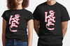
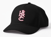
Unashamed merch plug..
I have some merch going for some of the logos I've made. Caps, shirts, mugs, hoodies, stickers, bags, phone cases and more are available at the links below. I've got 2 logos going, as they avoid (I believe) copyright infringement.
Here's a few pics of the merch


I have some merch going for some of the logos I've made. Caps, shirts, mugs, hoodies, stickers, bags, phone cases and more are available at the links below. I've got 2 logos going, as they avoid (I believe) copyright infringement.
Here's a few pics of the merch
Attachments

- Thread starter
- #111
Just click the 'view this on +# products' to see more stuffUnashamed merch plug..
I have some merch going for some of the logos I've made. Caps, shirts, mugs, hoodies, stickers, bags, phone cases and more are available at the links below. I've got 2 logos going, as they avoid (I believe) copyright infringement.
Here's a few pics of the merch
View attachment 1305749View attachment 1305750View attachment 1305748View attachment 1305751View attachment 1305752View attachment 1305753
George
Premium Platinum
- Aug 17, 2015
- 45,307
- 127,296
- AFL Club
- St Kilda
- Other Teams
- Phi Eagles & Phillies, Liverpool, PAO FC
- Banned
- #112
Stickman cap looks gorgeous mate, well doneUnashamed merch plug..
I have some merch going for some of the logos I've made. Caps, shirts, mugs, hoodies, stickers, bags, phone cases and more are available at the links below. I've got 2 logos going, as they avoid (I believe) copyright infringement.
Here's a few pics of the merch
View attachment 1305749View attachment 1305750View attachment 1305748View attachment 1305751View attachment 1305752View attachment 1305753
- Thread starter
- #113

150 Year logo.
Half arsed
Jack Stevens
#2 Ticket Holder
Where did you find this? Can't see it anywhere on the internet or in emails.
I don't mind it, I think it's achieved most of what you've been pushing for. I'm assuming we'll adopt the shield full time moving forwards.
Also can't believe it will have been 10 years since we wore the hoops jumper for the 140th.
- Thread starter
- #115
Reddit r/aflWhere did you find this? Can't see it anywhere on the internet or in emails.
I don't mind it, I think it's achieved most of what you've been pushing for. I'm assuming we'll adopt the shield full time moving forwards.
Also can't believe it will have been 10 years since we wore the hoops jumper for the 140th.
Ehh the linework still needs a bit of TLC.That weird point on the bottom of the shield, the seperate black outer line muddying up things.. I could have done better

Prefer our normal one lol
- Thread starter
- #117


- Thread starter
- #118

Diehard Saint
Brownlow Medallist
Very meh.
- Nov 7, 2012
- 10,367
- 33,873
- AFL Club
- St Kilda
- Other Teams
- Bristol City FC, Urawa Red Diamonds FC
Don't mind it but yeah, a bit half-arsed not that inspiring. Essentially they've tried to get as close as they can to that little metal crest from the thirties
Jack Stevens
#2 Ticket Holder
Oh yeah yuck I really wish you hadn't pointed out the bottom of the shield. Really not a fan of how it and the cross are rounded off, needs to be a nice crisp point.Reddit r/afl
Ehh the linework still needs a bit of TLC.That weird point on the bottom of the shield, the seperate black outer line muddying up things.. I could have done better
- Mar 14, 2011
- 14,726
- 77,996
- AFL Club
- St Kilda
- Other Teams
- Leeds united, Chicago Bulls
Hubnester
Moderator
- Jul 11, 2010
- 5,514
- 13,615
- AFL Club
- St Kilda
- Moderator
- #125
Pretty good, better readability at different sizes, and I like that the pencil-thin black line was removed but the white stroke remains.
Will it carry on to replace our current logo going forward or is it just for the coming year, do we know?
Will it carry on to replace our current logo going forward or is it just for the coming year, do we know?
Similar threads
- Locked
- Replies
- 350
- Views
- 7K
- Locked
- Replies
- 220
- Views
- 9K
- Locked
- Replies
- 119
- Views
- 5K
- Locked
- Poll
- Replies
- 116
- Views
- 5K
- Replies
- 69
- Views
- 3K
- Locked
- Replies
- 480
- Views
- 9K
