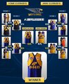
Ochre
Premium Platinum
LANDSLIDE WINNER
is an anagram of
WIN? NA, L! NERDS LIED!
Where does the corruption end?
is an anagram of
WIN? NA, L! NERDS LIED!
Where does the corruption end?
Follow along with the video below to see how to install our site as a web app on your home screen.
Note: This feature may not be available in some browsers.
Again with these retro ads they get their decades mixed up. 1970s title font, 1980s boombox and telly, 1995 guernsey.
New one fell into the trap of trying to look all 3D and digitalThe old AFL logo was the best. The current one hasn't aged well at all, while the original was timeless.
Our best team by a fair margin tooThey better release one. 1994 has been the forgotten premiership


They better not. In the original fan vote at the start of the #returnthewings campaign, it got its ass handed to it by the royal. It was far closer vote wise to the Ochre than to any royal or yellow wings jumper.You just know that the popularity of this is going to give the club justification to bring back the navy as one of our primary on field colours

You mean The Landslide Loser?I will not rest until the Ochre returns. Greatest WCE guernsey of all time. OF ALL TIME!
He's growing on me slowly.Ochre is piece of s**t.
The ochre is aptly poo coloured.I will not rest until the Ochre returns. Greatest WCE guernsey of all time. OF ALL TIME!
Must be all the nice things I say about PerthHe's growing on me slowly.
I would go see a doctor immediately.The ochre is aptly poo coloured.
It will happen when the general fashion stops just regurgitating previous eras (with shit modern twists) and creates something unique. I don't understand Gen Z and their obsession with fake nostalgia (for times that they never lived).Ochre is piece of s**t. I’m waiting for the day when AFL fans move on from their obsession with shite retro kits.
