Navigation
Install the app
How to install the app on iOS
Follow along with the video below to see how to install our site as a web app on your home screen.
Note: This feature may not be available in some browsers.
More options
You are using an out of date browser. It may not display this or other websites correctly.
You should upgrade or use an alternative browser.
You should upgrade or use an alternative browser.
Mega Thread The Port Store Mega Thread Part 2
- Thread starter Mangus Onfries
- Start date
- Tagged users None
TeeKray
Moderator
- Moderator
- #5,328
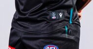
Collar looks great. Will pass judgement on the split chevrons and teal trim until I see it on field.
Don't know why we persist with the white clash. We finally mastered the silver guernsey when we added the black collar and sleeve with the 2021/2022 version and then went straight back to the boring white wash.
Don't know why we persist with the white clash. We finally mastered the silver guernsey when we added the black collar and sleeve with the 2021/2022 version and then went straight back to the boring white wash.
Yuk~ Repost @ThePortStore ~
𝐁𝐔𝐈𝐋𝐓 𝐅𝐎𝐑 𝐁𝐀𝐓𝐓𝐋𝐄, 𝐌𝐀𝐃𝐄 𝐅𝐎𝐑 𝐏𝐎𝐑𝐓 𝐀𝐃𝐄𝐋𝐀𝐈𝐃𝐄.
Our 2025 Home Guernsey, Clash Guernsey and On-Field Training range by Macron is now available in-store and online
Macron - Page 1 - Port Store | Official Online Store of the Port Adelaide Football Club
Explore Macron's premium sportswear at PortStore. Elevate your athletic style with high-quality gear and classic designs. Shop now!portstore.com.au
View attachment 2187066View attachment 2187067View attachment 2187068
- May 3, 2015
- 2,707
- 5,372
- AFL Club
- Port Adelaide
- Other Teams
- Liverpool FC
So flipping tacky... Really over the chevron guernsey now, need an overhaul.
Dylan8
Bar Up
Collar is cool as ****
Didn't pass the collingwood testDon't know why we persist with the white clash. We finally mastered the silver guernsey when we added the black collar and sleeve with the 2021/2022 version and then went straight back to the boring white wash.
Port2Power
All Australian
Didn't pass the collingwood test
Is this a fact?
We wore the Silver guernsey for several seasons.
Didn't pass the collingwood test
That wouldn't surprise me. Would look crap with a teal chevron though, which is probably all Collingwood would allow.
- Jun 12, 2012
- 21,159
- 67,687
- AFL Club
- Port Adelaide
Didn't pass the collingwood test
It’s already ridiculous that the amateurs running this league have given one club exclusive rights to one particular colour combination but it’s downright absurd that they can also veto a colour they don’t even use.
We probably gave the silver guernsey up during bargaining for the showdown PBs.
It’s already ridiculous that the amateurs running this league have given one club exclusive rights to one particular colour combination but it’s downright absurd that they can also veto a colour they don’t even use.
We probably gave the silver guernsey up during bargaining for the showdown PBs.
Kochead's opening gambit.
Janey
Premium Platinum
I tend to agree, the women’s jumper looks a bit more subtle and classier imo.The chevrons on the men's look way too big. The aflw kit is much better on the eye.
tribey
ʎǝlʞuᴉH ʞɔɐS
Doctor Feel
Shitposter In Chief
Collar good, everything else terrible. Looks like the merch drought continues.
Fizzler
TAKE BACK PAFC
- Dec 26, 2013
- 13,511
- 18,169
- AFL Club
- Port Adelaide
- Other Teams
- OKC, Coburg, Werribee, Storm, QPR
Us playing away against Collingwood while we had the silver clash jumper was pretty horrid in terms of contrast. In motion, their black and white blends together to look kind of grey, and here we were wearing an actual grey jumper. I went to one of those matches and I can tell you that the white clash jumper is a much better matchup against them. That said, I do prefer the grey jumper, looked a treat in every other matchup.Is this a fact?
We wore the Silver guernsey for several seasons.
bomberclifford
Importer/Exporter
Someone really misunderstood what BringBackTheBars meant.
- Nov 5, 2015
- 6,643
- 12,100
- AFL Club
- Port Adelaide
How many more years of this Macron shite?
Dylan8
Bar Up
Utterly swagless brand aren't they. Bring in KappaHow many more years of this Macron shite?
Collingwood didn't like the black and white VCollar looks great. Will pass judgement on the split chevrons and teal trim until I see it on field.
Don't know why we persist with the white clash. We finally mastered the silver guernsey when we added the black collar and sleeve with the 2021/2022 version and then went straight back to the boring white wash.
What's that finger paint shit at the bottom
Can we go back to Nike
- Aug 21, 2007
- 33,368
- 110,768
- AFL Club
- Port Adelaide
- Other Teams
- Aston Villa, San Antonio Spurs
Hold on for the PB version before I make a judgement, I can hardly judge it on the generic footy guernsey in our colours that we wear at home.
Looks no different besides the collar, which is an improvement.
The tiny split in the chevrons is neither here nor there.
Not keen on the white clash but it does look better with the collar and plain white with no light grey patterns that just made the guernseys look dirty.
The training guernseys being a bit of a throwback to the 2002 training guernseys we had is kind of cool.
The training tops with the PA logo are okay too.
Sent from my iPhone using BigFooty.com
The chevrons on the men's look way too big. The aflw kit is much better on the eye.
The cotton on stuff is way worse than Macron in my opinion.
Sent from my iPhone using BigFooty.com
Portwrld
Debutant
- Nov 14, 2024
- 74
- 78
- AFL Club
- Port Adelaide
How many more years of this Macron shite?
4 more years it got unfortunately extended last season. https://www.portadelaidefc.com.au/news/1481158/macron-apparel-extend-partnership-for-four-more-years
Similar threads
- Replies
- 1K
- Views
- 55K
- Replies
- 10K
- Views
- 310K
- Replies
- 39
- Views
- 980
- Replies
- 10K
- Views
- 266K
- Replies
- 10K
- Views
- 322K
- Replies
- 191
- Views
- 9K


