Portwrld
Debutant
- Nov 14, 2024
- 66
- 68
- AFL Club
- Port Adelaide
I may be in the minority, but god, when are we gonna get rid of the v jumper design altogether?
I never really liked the design of it, and to be honest, I’ve never liked the current badge either. To me it doesn’t feel like Port Adelaide; it feels like a constant reminder that this is David Koch/Ken Hinkley’s Port Adelaide. Shit and mediocre.
There is no symbolic meaning in the jumper like the Prison Bar Strip or the lightning bolt designs.
When is the club finally gonna do like the Anaheim Ducks of the NHL and do a full retro rebrand, go back to our roots, and embrace its lightning bolt/power roots?
I would like the club to do something like this..
Logo/Badge

Design 1 - Home
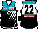
Design 1 - Away
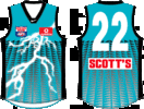
Design 2 - Home
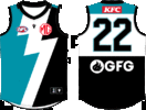
Design 2 - Away
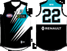
I never really liked the design of it, and to be honest, I’ve never liked the current badge either. To me it doesn’t feel like Port Adelaide; it feels like a constant reminder that this is David Koch/Ken Hinkley’s Port Adelaide. Shit and mediocre.
There is no symbolic meaning in the jumper like the Prison Bar Strip or the lightning bolt designs.
When is the club finally gonna do like the Anaheim Ducks of the NHL and do a full retro rebrand, go back to our roots, and embrace its lightning bolt/power roots?
I would like the club to do something like this..
Logo/Badge

Design 1 - Home

Design 1 - Away

Design 2 - Home

Design 2 - Away

Last edited:





 .
. 
