Navigation
Install the app
How to install the app on iOS
Follow along with the video below to see how to install our site as a web app on your home screen.
Note: This feature may not be available in some browsers.
More options
You are using an out of date browser. It may not display this or other websites correctly.
You should upgrade or use an alternative browser.
You should upgrade or use an alternative browser.
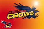
Opinion Adelaide Crows New Logo Discussion
- Thread starter Skinny_Love18
- Start date
- Tagged users None
Checksider
All Australian
- Jul 23, 2023
- 778
- 1,579
- AFL Club
- Adelaide
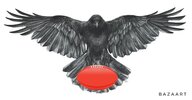
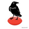
It’s a Crow body. He’s just been hitting the gym.Any logo that shows the Crow as having a human body is bad
I could go a crows milk right about now
I love this guy, bought the 90s throwback hat this year with him on it, but not for an official logo.
Good for kids marketing though.
On SM-A325F using BigFooty.com mobile app
He definitely deserves a place in history.I love this guy, bought the 90s throwback hat this year with him on it, but not for an official logo.
Good for kids marketing though.
On SM-A325F using BigFooty.com mobile app
dogs105
Sweet Kennels Proprietor
SugarShane
C12 H22 O11
How hard it is to come up with a decent replacement really hammers home how elite our original one was.
Same as a crow flying with one I guess....Any logo that shows the Crow as having a human body is bad
bomberclifford
Importer/Exporter
Saw this on the GD board and thought it would be good to post here.
The stylising of the eagle head is very good, right down to the emblem maintaining a circular shape. Would look great on merch.
Wondering if a Crow head rendered in the same manner would work for AFC?

The stylising of the eagle head is very good, right down to the emblem maintaining a circular shape. Would look great on merch.
Wondering if a Crow head rendered in the same manner would work for AFC?
Looks very West Coast.Saw this on the GD board and thought it would be good to post here.
The stylising of the eagle head is very good, right down to the emblem maintaining a circular shape. Would look great on merch.
Wondering if a Crow head rendered in the same manner would work for AFC?

Andonis1997
Sporting masochist
That logo is not exactly great either.Saw this on the GD board and thought it would be good to post here.
The stylising of the eagle head is very good, right down to the emblem maintaining a circular shape. Would look great on merch.
Wondering if a Crow head rendered in the same manner would work for AFC?

The further the Crows stray away from bird heads, the better.
bomberclifford
Importer/Exporter
Looks very West Coast.
Well it is an eagle. Not much they can do about that.
- Aug 6, 2021
- 6,997
- 12,870
- AFL Club
- Adelaide
My preference would be for a whole body logo, not just a Crow’s head.Saw this on the GD board and thought it would be good to post here.
The stylising of the eagle head is very good, right down to the emblem maintaining a circular shape. Would look great on merch.
Wondering if a Crow head rendered in the same manner would work for AFC?

- May 5, 2019
- 5,042
- 5,498
- AFL Club
- Adelaide
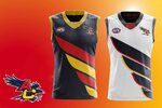
Maybe it’s just me but too much red and yellow next to each other looks cheap and fast food franchise like.
MarkCorrigan
Rookie
- Jul 28, 2016
- 32
- 118
- AFL Club
- Adelaide
- May 5, 2019
- 5,042
- 5,498
- AFL Club
- Adelaide
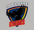
I dont mind the away guernsey but the logo looks like a Japanese cartoon
We finally have good home and away jumpers, and people want to change them???
On SM-A325F using BigFooty.com mobile app
On SM-A325F using BigFooty.com mobile app
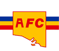
I've always thought it would be nice to get something SA related in the logo - like an outline of the state. I've had a mess around with the CFS logo, but I have no photoshop skills so can't get very far. Obviously it needs a crow graphic.. but just a thought.
Attachments
Similar threads
- Replies
- 146
- Views
- 3K
- Replies
- 1K
- Views
- 35K
- Poll
- Replies
- 581
- Views
- 24K
- Replies
- 5K
- Views
- 198K


