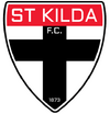
Opinion The Shield and Ribbon: Updating the Sacred

Remove this Banner Ad

Logos serve a very different purpose than they did even 15 or so years ago, they need something that can be reduced to size of a tiny avatar in a corner of a phone screen and still look good.

As for the fallacy that the only the Saints could f*** up a club logo, just have a look at Essendon, or any of the Gold coast Suns efforts to date. Even the great Manchester United try to copy Liverpool's simplification of their logo with hilarious results.

I'm pessimistic, too. But in the end, if it doesn't work, we can always change it back again.

Our logo has a long and more meaningful history than any other club. We have ruined our logo on our jumper so I hope we don’t do the same here.
I can tolerate a slight modernisation of our current logo but any move away from it will be met with a hell of a lot of resistance.
I just hope they haven’t jumped the shark here.
 

Log in to remove this ad.

I’m really worried this is going to blow up in the clubs face if they’ve moved too far from the original crest.

That is the worry.

Sometimes looking “back to the future” is the best approach when changing symbols that inspire devotion and emotion.

In 2015 the Bulldogs reverted to their pre-1975 guernsey which was junked with the introduction of colour TV. In 2016 they won a Flag in it which was wonderful. I think this jumper is beautiful and their people love it.

Hawks in recent years have also reverted to a more traditional strip which was changed in 1975.

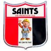
I never understood why Saints changed their crest after 1996. People loved and identified with it. I’m one of them.


Sent from my iPhone using Tapatalk
 
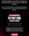
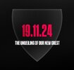
From the promo, it would appear that it is purely a refresher of the crest. Not a stick man or angel, etc.

I think it will be pretty minor and quite contemporary, which I'm all for.

I’m happy enough with a refresh, but if it’s just that then you think a launch of it would be a little over the top.
I’m genuinely worried.
 
I doubt the club is pre-announcing a release date, organising an event, offering passes as a "prize" etc. if it's just thickening an outline and having a bolder font.

This is gonna be a whole new look, and I'm trying to keep an open mind..... but there's a pretty high chance some marketing guru who's never seen a Saints game in their life is gonna stuff this up.
By god I hope it doesn't have "saints" written across it diagonally, as if it was quickly graffiti'd onto the logo.
 
I doubt the club is pre-announcing a release date, organising an event, offering passes as a "prize" etc. if it's just thickening an outline and having a bolder font.

This is gonna be a whole new look, and I'm trying to keep an open mind..... but there's a pretty high chance some marketing guru who's never seen a Saints game in their life is gonna stuff this up.

Yep

Some concept meeting would start with “Saint Kilda” on some AI slop image

Just as long as we keep it historically appropriate that’s all i need
 
It’s a bit of a risk holding event. What if they roll it out and people hate it? Bit of an odd event then…
Presumably it’s focussed grouped already though.
I’m cautiously optimistic. Dees have done the best refresh lately. Hopefully we keep it nice and simple like they did.


On iPhone using BigFooty.com mobile app
 

(Log in to remove this ad.)

I heard the club is really leaning into the angel theme. We are about to become the first catholic AFL club. The players, coaches and staff will need to be baptized or they will be traded or fired. The club has changed direction from bringing in elite Bayside talent, to devoted Catholics! The new extension of the giant mega church is due to start around Christmas. Fans will be able to attend and donate money in the name of the club, I mean father!

But nah I like this move. The beginning of a new era!
It could explain why my hopes and dreams die around Easter and reemerge at Christmas time.
 
I did notice a new stylised element at the bottom of the shield during posts about The Trevor Barker Award:

View attachment 2147951

Matches the same shape too… 🤔

View attachment 2147952

I personally liked the brief rebrand during the 150th Anniversary, shame it wasn’t kept as I felt it was a nice refresh.
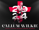
Good catch. There's a version of that logo with Wilkie in it, and it is fully silver (instead of red). Then there's this pivture of Wilkie with the cross behind him. I wonder if the logo will be a white version of that shield, with this red cross in it?
The bottom point of the cross is the same shape as the bottom of the logo, I haven't checked to see if the taper of the sides of the cross line up with the shield. It looks like it does, but a little lower. Perhaps leaving room for "St Kilda Saints" across the top.
No doubt they will remove the St. K. F. C.

1729404052969.png
 
Good catch. There's a version of that logo with Wilkie in it, and it is fully silver (instead of red). Then there's this pivture of Wilkie with the cross behind him. I wonder if the logo will be a white version of that shield, with this red cross in it?
The bottom point of the cross is the same shape as the bottom of the logo, I haven't checked to see if the taper of the sides of the cross line up with the shield. It looks like it does, but a little lower. Perhaps leaving room for "St Kilda Saints" across the top.
No doubt they will remove the St. K. F. C.

View attachment 2148239
Putting "St Kilda Saints" on the logo would be just about the worst thing they could do. Absolutely spew-worthy.
 
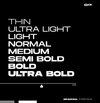
My best guess is that it will be something like this, using the font as shown below (my best match is Brachial from matching images).

F.C. could well be in the upper section or left off, as well as the 1873.
images (11) (1).png IMG_4971.jpeg Screenshot_20241021_152751_Chrome.jpg
 
"Our crest’s legacy is stronger than ever, but it’s time for the next generation to carry the torch."

What does that even mean?

Our branding is strong but we're going to change it for the next generation.
Who is asking for this?
 

Remove this Banner Ad

Opinion The Shield and Ribbon: Updating the Sacred

Remove this Banner Ad

Back
Top