One of the worst rebrandings I’ve ever seenWhereas Ajax have gone the opposite direction, instead of the clean 2020's style, they've gone back to the 5th century BC for inspiration.
Navigation
Install the app
How to install the app on iOS
Follow along with the video below to see how to install our site as a web app on your home screen.
Note: This feature may not be available in some browsers.
More options
-
 BigFooty AFLW Notice Img
AFLW 2024 - Round 10 - Chat, game threads, injury lists, team lineups and more.
You are using an out of date browser. It may not display this or other websites correctly.
You should upgrade or use an alternative browser.
You should upgrade or use an alternative browser.
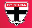
Opinion The Shield and Ribbon: Updating the Sacred
- Sep 2, 2024
- 23
- 43
- AFL Club
- St Kilda
Boooooooooooooooo…Says ST KILDA instead of ST KFC
- Jun 9, 2015
- 12,595
- 9,703
- AFL Club
- St Kilda
We’re a shit showSt Kilda is a suburb.
Are we, or are we not a football club?
seesalswigs44
Rookie
- Jul 14, 2023
- 36
- 111
- AFL Club
- St Kilda
I actually didn’t mind Ajax’s haha but fair enough always the way with these thingsWhereas Ajax have gone the opposite direction, instead of the clean 2020's style, they've gone back to the 5th century BC for inspiration.
Let be honest.....we're a football business. A franchise.Are we, or are we not a football club?
Clubs are long gone in the AFL....
seesalswigs44
Rookie
- Jul 14, 2023
- 36
- 111
- AFL Club
- St Kilda
Just seen it, it’s alright I guess haha
- Sep 2, 2024
- 23
- 43
- AFL Club
- St Kilda
Just saw the tweet.
I don’t like it. In fact, the more I watch the video, the less I like it.
Of course, it’s all subjective but I can’t help but feel it was all dumbed down for the morons who don’t understand “KFC” and to pinch pennies on sewing the patch to put on scarves and whatnot.
Thumbs down from this grumpy, old bastard.
- Oct 23, 2002
- 261
- 1,000
- AFL Club
- Tasmania
- Other Teams
- St. Kilda
It's up on the socials now.
I like it - considering what it could have been....
I like it - considering what it could have been....
Pakenhamsaint
Hall of Famer
- Jan 5, 2011
- 47,633
- 39,702
- AFL Club
- St Kilda
It could be worse.
seesalswigs44
Rookie
- Jul 14, 2023
- 36
- 111
- AFL Club
- St Kilda
Clean and bold
Dr Spaceman
Premium Gold
I’m a traditionalist but it’s growing on me already
Michael Scarn
Club Legend
Not bad
Hubnester
Moderator
- Jul 11, 2010
- 5,561
- 13,734
- AFL Club
- St Kilda
- Moderator
- #392
Don't mind that actually. Found a way to keep the ribbon and integrate it into the design, a good clear heading and cleaner lines. It will just take some getting used to having the shield shape broken up a little bit.
This will look a lot nicer in a many use cases.
This will look a lot nicer in a many use cases.
- Jun 9, 2015
- 12,595
- 9,703
- AFL Club
- St Kilda
Garbage, looks like a stupid modernized soccer logo or generic logo from any game you can create your own team. All they had to do was bolden the font and outlines
Edit- after watching the Facebook video it looks ok on merch but not stand alone or on the guernsey
Edit- after watching the Facebook video it looks ok on merch but not stand alone or on the guernsey

Last edited:
I don't like that it looks like there's a bit of an optical illusion to me.
At the bottom of the cross, under the simplified banner, it looks almost like its a triangle that is just left of centre.
I lined it up with my phone and the cross does go in a straight line even under the banner, but it just looks misaligned to me for some reason.
At the bottom of the cross, under the simplified banner, it looks almost like its a triangle that is just left of centre.
I lined it up with my phone and the cross does go in a straight line even under the banner, but it just looks misaligned to me for some reason.
Southeastsainter
Rookie
- Jul 22, 2024
- 38
- 202
- AFL Club
- St Kilda
The black patch on the guernsey is horrendous. Logo looks fine, not sure why we needed to change it! But better than Gold Coasts effort.
Diehard Saint
Brownlow Medallist
It OK. Meh. Still don't see why they couldn't keep the FC.
- Mar 14, 2011
- 16,831
- 86,604
- AFL Club
- St Kilda
- Other Teams
- Leeds united, Chicago Bulls
Don’t mind it.
Cleaner image for the modern age.
Be grateful for this. It could have been so much worse
Cleaner image for the modern age.
Be grateful for this. It could have been so much worse
Hubnester
Moderator
- Jul 11, 2010
- 5,561
- 13,734
- AFL Club
- St Kilda
- Moderator
- #399
I don't like that it looks like there's a bit of an optical illusion to me.
At the bottom of the cross, under the simplified banner, it looks almost like its a triangle that is just left of centre.
I lined it up with my phone and the cross does go in a straight line even under the banner, but it just looks misaligned to me for some reason.
Hmm I'm not seeing that, but if I was to guess is it the 'EST 1873' that's creating the illusion? The joys of working with text that can't be made to be balanced or symmetrical haha
Dr Spaceman
Premium Gold
With the rules and regulations from the AFL regarding placement and size, has the change to the ribbon allowed for a bigger shield on the jumper 
![ing]](/forum/proxy.php?image=https%3A%2F%2Fi.imgur.com%2FZALY5yn.jpeg%5B%2Fing%5D&hash=e272dbcf3b43797c5a5d5d1dd694af5d)

![ing]](/forum/proxy.php?image=https%3A%2F%2Fi.imgur.com%2FZALY5yn.jpeg%5B%2Fing%5D&hash=e272dbcf3b43797c5a5d5d1dd694af5d)
Similar threads
- Locked
- Replies
- 350
- Views
- 7K
- Locked
- Replies
- 220
- Views
- 10K
- Locked
- Replies
- 119
- Views
- 5K
- Locked
- Poll
- Replies
- 116
- Views
- 5K
- Replies
- 69
- Views
- 3K


